This graphics library is useful for creating Scalable Vector Graphics plots of scientific data and is has the following modes: scatter plot, line plot, bar plot, histogram, stacked barplot, and stacked histogram modes. Multiplotting of data on one graph is supported.
Because of its reliance on reading and writing from the local file system using XUL based functions, it is not currently possible to use these routines for web-pages. Rather, JSvg makes it possible to do basic data processing and display client-side when the html page in question is hosted on the localhost.
Note that this help file and updated example code are included with OpenTrack. (January 19, 2013, OT version 0.10.2).
Contents
Basics
Scatterplot
Series Scatterplot
Multiplot1
Bar Plot
Series Bar Plot
Stacked Bar Plot
Histogram
Simple Histogram
Stacked Histogram
Multiplot2
In order to use any of the functions shown below, you should include the following javascript libraries in the header of your page:
libxpcom.js		// File system access
libgraphproperties.js 	// Basic attributes that can be set in graphs
libgraphsupport.js	// Supporting functionality for graphics
libgraphbase.js		// Base functions that write graphs
statlib.js		// Statistics and numerical routines that are needed
Should you wish to create scatterplots, use:
libgraphscatter.js
And for bar graphs and histograms use:
libgraphbar.js
A comprehensive example of the usage of this library can be found upon downloading in the file samples.htm.
In JSvg, every item on the plot is an object. A full list of objects may be found in the file: libgraphproperties.js. In the example below, the following objects and properties are utilized:
| optsGraphTitles[0].name | x axis label |
| optsGraphTitles[1].name | y axis label |
| optsGraphTitles[2].name | Graph label |
| optsSeries[0].color | 1st series color |
| optsSeries[0].name | 1st series name (for legend) |
| optsSeries[0].itype | 1st series interpolation
0 - None (just plot points) 1 - Linear (linear fill in between points) 2 - Spline (cubic spline fill in between points) [Currently spline is buggy v0.1] |
| optsSeries[0].ltype | 1st series line type If itype == 0 then: 0 - Circles 1 - Squares 2 - Asterisks 3 - Plus Signs If itype != 0 then:
|
| xprec | Precision to show on the x axis numbers |
| yprec | Precision to show on the y axis numbers |
function test1Dscatterplot() {
        // How to create a 1D scatter plot
        // First create 1D arrays of data
        var xdat = [0.0,0.1,0.23,0.29,0.31,0.4,0.53,0.6,0.71,0.80];
        var ydat = [0.80,0.69,0.61,0.51,0.39,0.30,0.28,0.19,0.10,0.0];

        // Then set attributes such as titles and colors
        optsGraphTitles[0].name = "1/di";
        optsGraphTitles[1].name = "1/d0";
        optsGraphTitles[2].name = "1/d0 vs. 1/di";
        optsSeries[0].color = "blue";
        optsSeries[0].name = "Data";
        optsSeries[0].itype = 0;
        optsSeries[0].ltype = 0;// If itypes = 0, ltypes doesn't matter
        xprec = 2;      // Precision to display on the axes
        yprec = 2;
        getAutoRange1D(xdat,ydat);      // Check range before plotting
        drawPlot(xdat,ydat,0,0);        // Draw graph and set SVG file
        finalPlot();    // Show graph (but not a multi-graph)
}
The output of this is shown below.
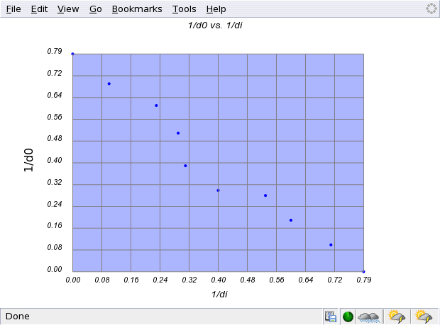
(Note the menubar from the browser and the status bar at the bottom. A number of small icons from extensions are visible.)
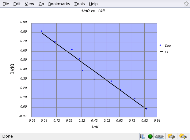
Series Scatterplots are for displaying multiple plots on a single graph.
Here the data from the previous example is utilized to create a linear fit
as the second series. Note that each series is an array within an array. So
the first series x-values are in xdat[0]; the second series x-values are in
xdat[1]. To create a linear fit:
        var coefs = linCor2(xdat[0],ydat[0]);
        xdat[1] = xdat[0];
        ydat[1] = modelPolyFit(coefs,xdat[1]);
The first line returns the coefficients [slope,intercept], the second
sets the second series x-values, and the third uses the coefficients to
estimate the second series y-values. optsSeries[1].itype is set to
one so that lines or curves will be drawn, and optsSeries[1].ltype is
set to 0 so that a solid line connects the points of the second series.
The full function example for creating this sort of scatterplot is
shown below.
function test2Dscatterplot() {
        // How to create a 2D scatter plot, meaning that there are more
        // than 1 x and y series of data.
        var xdat = new Array();         // First create data arrays
        var ydat = new Array();
        // First Series Data - sub array 0 of data arrays
        xdat[0] = [0.0,0.1,0.23,0.29,0.31,0.4,0.53,0.6,0.71,0.80];
        ydat[0] = [0.80,0.69,0.61,0.51,0.39,0.30,0.28,0.19,0.10,0.0];
        // Set attributes
        optsSeries[0].color = "blue";
        optsSeries[0].name = "Data";
        optsSeries[0].itype = 0;
        optsSeries[0].ltype = 0;// If itypes = 0, ltypes doesn't matter
        // Second Series Data (a fit!)
        // -- up to a third degree polynomial may be fit with this library
        var coefs = linCor2(xdat[0],ydat[0]);   // [slope,intercept];
        xdat[1] = xdat[0];
        ydat[1] = modelPolyFit(coefs,xdat[1]);  // modelPolyFit is the
                                // polynomial fitting function
        // Set attributes
        optsSeries[1].color = "black";
        optsSeries[1].name = "Fit";
        optsSeries[1].itype = 1;
        optsSeries[1].ltype = 0;// If itypes = 0, ltypes doesn't matter
        // Global attributes
        optsGraphTitles[0].name = "1/di";
        optsGraphTitles[1].name = "1/d0";
        optsGraphTitles[2].name = "1/d0 vs. 1/di";
        xprec = 2;              // Set the precision of the axes
        yprec = 2;
        drawSeriesPlot(xdat,ydat,0,0);  // This function autoranges
        finalPlot();    // Show graph (but not a multi-graph)
}
The output of this is shown below.
JSvg is also capable of plotting multiple graphs on a page. The following function illustrates how this is accomplished. Essentially, the data is stored as with as series scatterplot. But the functions of interest are:
mgraph1D()The first uses the series and its attributes to create the graphs in question. Two of the arguments to the mgraph1D() function are row and column. These parameters tell JSvg how many rows and columns to display. Theoretically, one could put as many as one likes, but the window would be rather large. JSvg plots by row first and then by column in the order that the data is added to the xdat and ydat variables. So if one had six series stored in the xdat and ydat variables and one specified 2 rows and 3 columns, the first three series would end up in the first row of graphs and the last three series would end up in the second row of graphs. An example of how to due a multiplot of several series graphs is given later.
finalMultiPlot()
function testMultiScatterplot() {
        // This function is for the display of multiple graph windows
        // on a single page. Currently only single scatter-plots are
        // supported.
        var xdat = new Array();
        var ydat = new Array();
        var glabArr = new Array();      // Graph labels
        var xlabArr = new Array();      // X-axes labels
        var ylabArr = new Array();      // Y-axes labels
        var colors = new Array();       // Graph colors
        var names = new Array();        // Names to display in the legend
        var ltypes = new Array();       // Line types
        var itypes = new Array();       //
        var xprecArr = new Array();     // Precisions for the axes
        var yprecArr = new Array();

        optsLegend = false; // Turn legend off
        // First Graph
        // Set data
        xdat[0] = [0.0,0.1,0.23,0.29,0.31,0.4,0.53,0.6,0.71,0.80];
        ydat[0] = [0.80,0.69,0.61,0.51,0.39,0.30,0.28,0.19,0.10,0.0];
        // Set attributes
        glabArr[0] = '1/d0 vs. 1/di';
        xlabArr[0] = '1/di';
        ylabArr[0] = '1/d0';
        colors[0] = "blue";
        names[0] = "Series 1";
        itypes[0] = 0;
        ltypes[0] = 0; // If itypes = 0, ltypes doesn't matter
        xprecArr[0] = 2;
        yprecArr[0] = 2;

        // Second Graph
        // Set data
        xdat[1] = new Array();
        ydat[1] = new Array();
        for (var i=0; i< 360; i++) {
                xdat[1][i] = i;
                ydat[1][i] = 5*Math.sin(3.14*i/180.0);
        }
        // Set attributes
        glabArr[1] = 'y = sin(x)';
        xlabArr[1] = 'x (degrees)';
        ylabArr[1] = 'y';
        colors[1] = "green";
        names[1] = "Series 2"
        itypes[1] = 0;
        ltypes[1] = 0;
        xprecArr[1] = 0;
        yprecArr[1] = 1;
        mgraph1D(xdat,ydat,xlabArr,ylabArr,glabArr,1,2,colors,names,ltypes,itypes,xprecArr,yprecArr)
        finalMultiPlot(1,2);    // Shows a multiplot based on the number of rows and
                                // columns specified
}
An example of the output of the above function is below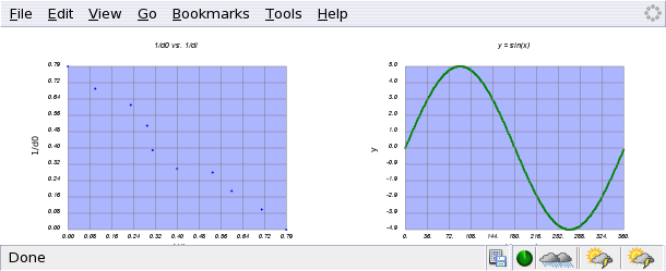
Bar plots are used to express ordinal data on the x-axis versus numeric data on the y-axis.
As such, the method for assigning x-axis values differs. In the following example, the
array: optsLabelX is used to store the values to be displayed on the x-axis. As before,
ydat is a numeric array. Other options that are shown in this function (but that are
universal to JSvg) are optsPlotAreaColor. Note that all JSvg colors can be given in
HTML coding (i.e. blue = "#0000FF").
function testBarplot() {
        optsLabelX = ['Jan','Feb','Mar','Apr','May','Jun',
			'Jul','Aug','Sep','Oct','Nov','Dec'];
        var ydat = [30,32,40,48,60,75,82,81,72,61,49,38];
        optsSeries[0].color = "blue";
        optsPlotAreaColor = "silver"
        optsGraphTitles[0].name = "Month";
        optsGraphTitles[1].name = "Temp (deg F)";
        optsGraphTitles[2].name = "Temperature by Month";
        optsGraphTitles[3].name = "for Eastern Pennsylvania";
        drawBarPlot(ydat,0,0);
        finalPlot();
}
The output of this function is shown below.

Currently, there is no straight-forward way to get nice numbers on the y-axis.
By combining the ideas from the bargraph and the series scatterplot from above, it is
possible to create a series bargraph. The variable optsLabelX is used to label the
common x-axis, while each series to be displayed is stored in ydat[i] as shown below. The
command used to create the plot is drawBarSeriesPlot(ydat,row,col) where ydat is the
array of data to be plotted, and the values row and column designate which row/column
index to attach to the graph.
function testSeriesBarplot() {
        optsLabelX = ['Jan','Feb','Mar','Apr','May','Jun',
		'Jul','Aug','Sep','Oct','Nov','Dec'];
        var ydat = new Array();
        // Note, these are sample data vectors.  For real data, check www.noaa.gov
        ydat[0] = [30,32,40,48,60,75,82,81,72,61,49,38]; // Pennsylvania
        optsSeries[0].name = "PA";
        optsSeries[0].color = "blue";
        ydat[1] = [25,30,38,46,56,71,80,77,69,59,45,33]; // New York
        optsSeries[1].name = "NY";
        optsSeries[1].color = "red";
        ydat[2] = [20,26,33,40,50,68,72,70,61,49,38,29]; // Maine
        optsSeries[2].name = "ME";
        optsSeries[2].color = "yellow";

        optsPlotAreaColor = "silver"
        optsGraphTitles[0].name = "Month";
        optsGraphTitles[1].name = "Temp (deg F)";
        optsGraphTitles[2].name = "Temperature by Month";
        optsLegend=true;
        drawBarSeriesPlot(ydat,0,0);
        finalPlot();
}
A sample series bar graph is shown below
The setup of this sort of plot is very similar to a series bar plot. The key difference is that the command: drawBarStackedPlot(ydat,row,col) is used to draw the graph.
function testStackedBarplot() {
        optsLabelX = ['Jan','Feb','Mar','Apr','May','Jun',
		'Jul','Aug','Sep','Oct','Nov','Dec'];
        var ydat = new Array();
        // Note, these are sample data vectors.  For real data, check www.noaa.gov
        ydat[0] = [115,125,105,80,70,75,90,110,78,68,95,105];
        optsSeries[0].name = "2003";
        optsSeries[0].color = "blue";
        ydat[1] = [125,135,100,90,72,70,83,100,80,65,98,111];
        optsSeries[1].name = "2004";
        optsSeries[1].color = "red";
        ydat[2] = [110,105,103,92,78,73,87,120,100,88,105,115];
        optsSeries[2].name = "2005";
        optsSeries[2].color = "yellow";

        optsPlotAreaColor = "silver"
        optsGraphTitles[0].name = "Month";
        optsGraphTitles[1].name = "Electric Bill $$";
        optsGraphTitles[2].name = "Electric Bill by Month";
        optsGraphTitles[3].name = "";
        drawBarStackedPlot(ydat,0,0);
        finalPlot();
}
A sample of this type of graph is shown below.
JSvg is capable of making several types of histograms. If your histogram involves
low numbers, you might choose to use the plain old histogram option as it gives relatively
nice numbers on the y-axis. It does this by counting up by ones. So if you have data
with large numbers...(well you can imagine), you might want to use the "simple histogram"
function (see below) or wait until the next release when this will be fixed.
The command to draw a histogram is:
drawHistogram(thedat,rangeVec,nbins,optincr,row,col).
function testHistogram() {
        var thedat = [70,75,67,78,85,92,76,89,50,69,78,68,51,85,84,92,86,
		94,83,57,87,88,92,
                67,45,97,99,79,72,
		82,85,87,73,86,73,
		72,59,62,63,88,90];
        var nbins = 6;
        var rangeVec = [40,100];        // Bracket max and min
        var optincr = 10;               // Optimal increment per bin
        optsSeries[0].color = "blue";
        optsGraphTitles[0].name = "Score";
        optsGraphTitles[1].name = "Number";
        optsGraphTitles[2].name = "Score Distribution";
        optsGraphTitles[3].name = "";
        drawHistogram(thedat,rangeVec,nbins,optincr,0,0)
        finalPlot();
}
A sample histogram is shown below.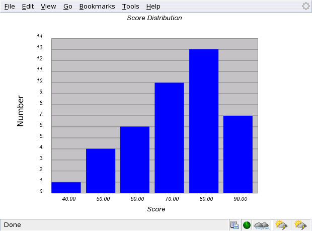
The key differences between a histogram and a "simple histogram" are that
the histogram requires one to specify a range (rangeVec) of max and min
values for the x-axis, an optimal increment between bins (this is over-ridden
by nbins) and the histogram does not display pure integers on the y-axis
except by chance. A "simple histogram" only requires the number of bins and data.
The function drawSimpleHistogram(thedat,nbins,row,col)
is used to draw this sort of graph.
function testSimpleHistogram() {
        var thedat = [70,75,67,78,85,92,76,89,50,69,78,68,51,85,84,92,86,
		94,83,57,87,88,92,
                67,45,97,99,79,72,
		82,85,87,73,86,73,
		72,59,62,63,88,90];
        var nbins = 6;
        optsSeries[0].color = "blue";
        optsGraphTitles[0].name = "Score";
        optsGraphTitles[1].name = "Number";
        optsGraphTitles[2].name = "Score Distribution";
        optsGraphTitles[3].name = "";
        drawSimpleHistogram(thedat,nbins,0,0)
        finalPlot();
}
A sample simple histogram is shown below.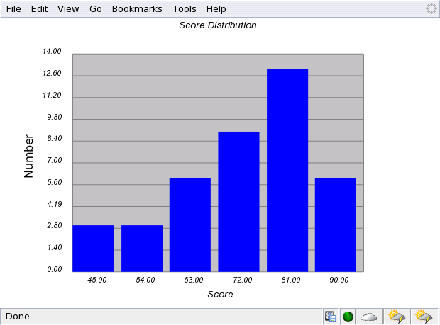
A stacked histogram is a histogram in which series data from related groups (such as different sections of the same class) is represented. The data is stored in the usual manner of a series graph with each series, i, being stored in ydat[i]. The command to create such a graph is: drawStackedHistogram(ydat,rangeVec,nbins,optincr,row,col)
function testStackedHistogram() {
        var ydat = new Array();
        ydat[0] = [34,42,45,51,56,59,62,66,67,69,70,73,75,83,85,90]; // 11 AM
        optsSeries[0].name = "11 AM Class";
        optsSeries[0].color = "blue";
        ydat[1] = [43,52,57,61,63,65,72,74,78,79,84,85,86,90,92]; // 12 PM
        optsSeries[1].name = "12 PM Class";
        optsSeries[1].color = "red";
        ydat[2] = [55,63,67,73,74,75,83,86,87,88,89,90,91,92,93]; // 1 PM
        optsSeries[2].name = "1 PM Class";
        optsSeries[2].color = "yellow";

        optsPlotAreaColor = "silver"
        optsGraphTitles[0].name = "Grade";
        optsGraphTitles[1].name = "Number of Students";
        optsGraphTitles[2].name = "PHY100 Scores";
        optsGraphTitles[3].name = "";
        optsLegend=true;
        var nbins =  7;
        var rangeVec = [30,100];
        var optincr = 10;
        drawStackedHistogram(ydat,rangeVec,nbins,optincr,0,0);
        finalPlot();
}
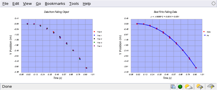
An example of this type of graph is shown below.

Finally, should one wish to make a multiplot with series in each graph or even
with different types of plots in each graph, the following code illustrates how
this is done.
function testMultiPlot2() {
        var xdat = new Array();
        var ydat = new Array();
        // Use javascript to generate the "data" from a falling object.
        var npt = 10.;
        for (var j=0; j< 5; j++) {
                // 5 trials
                var t = new Array(npt);
                var ydrop = new Array(npt);
                for (var i=0; i< npt; i++){
                        t[i] = i/npt + Math.random(1)*0.01;
                        ydrop[i] = -0.5*9.8*t[i]*t[i]+Math.random(1)*0.1;
                }
                xdat[j] = t;
                ydat[j] = ydrop;
                optsSeries[j].name = "Trial "+j;
                optsSeries[j].thick = 3;
        }
        multiXsize = 1.25*multiXsize;
        multiYsize = 1.25*multiYsize;
        optsGraphTitles[0].name = "Time (s)";
        optsGraphTitles[1].name = "Y Position (m)";
        optsGraphTitles[2].name = "Data from Falling Object"
        drawSeriesPlot(xdat,ydat,0,0);

        var xvals = new Array();
        var yvals = new Array();
        var count = 0;
        for (var i=0; i< 5; i++) {
                for (j=0; j< npt; j++) {
                        xvals[count] = xdat[i][j];
                        yvals[count] = ydat[i][j];
                        count++;
                }
        }
        solvec = quadCor(xvals,yvals);
        var yvalsMod = modelPolyFit(solvec,xvals);
        var xvals1 = new Array();
        var yvals1 = new Array();
        xvals1[0] = xvals;
        yvals1[0] = yvals;
        xvals1[1] = xvals;
        yvals1[1] = yvalsMod;
        optsSeries[0].name = "Data";
        optsSeries[1].name = "Fit";
        optsSeries[1].itype = 1;        // Make a line
        optsSeries[1].ltype = 0;
        optsGraphTitles[0].name = "Time (s)";
        optsGraphTitles[1].name = "Y Position (m)";
        optsGraphTitles[2].name = "Best Fit to Falling Data";
        optsGraphTitles[3].name = 'y = '+Number(solvec[0]).toFixed(3)+
                        't^2 + ' +Number(solvec[1]).toFixed(3)+
                        't + '+Number(solvec[2]).toFixed(3);
        drawSeriesPlot(xvals1,yvals1,0,1);
        finalMultiPlot(1,2);

}
The output from this code is shown below.